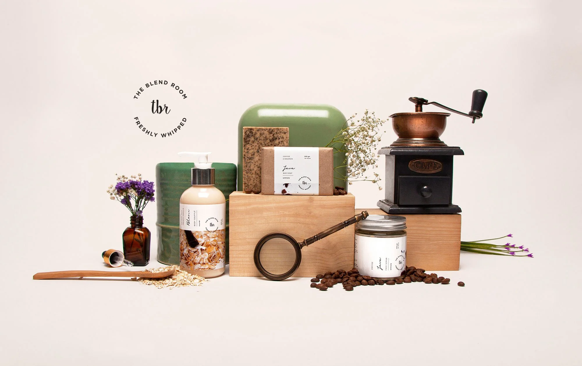
BRANDING & PHOTOGRAPHY
Artisanal personal care body products that are handcrafted with the belief that slow blending feels good and also does good.
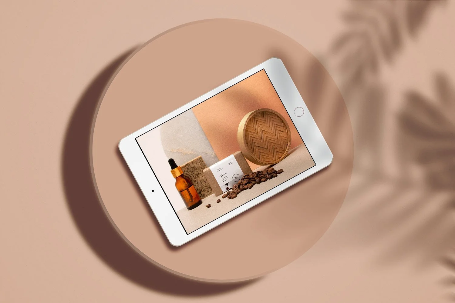
We were commissioned to design the entire brand language from naming to designing the logo, creating a visual language, crafting the labels for the products as well as the styling and photographing them for the online storefront.
CREDITS • This project was created in collaboration with Shreya Gupta who is a creative genius!

Building the basics.
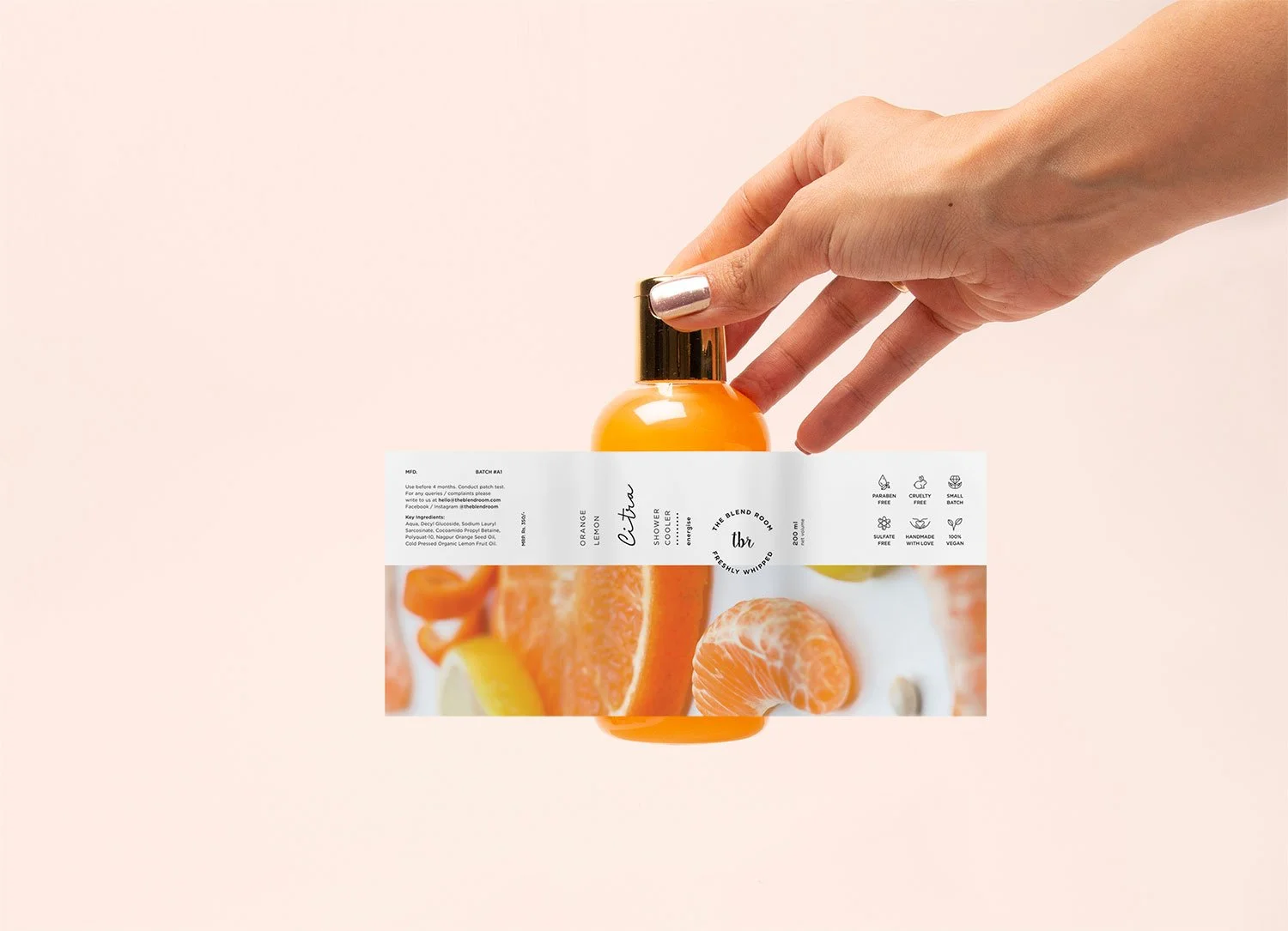
The logo was designed using a fluid amiable typeface. A stamp version of the logo is used across the product line to bring in the feeling of trust and reliability.
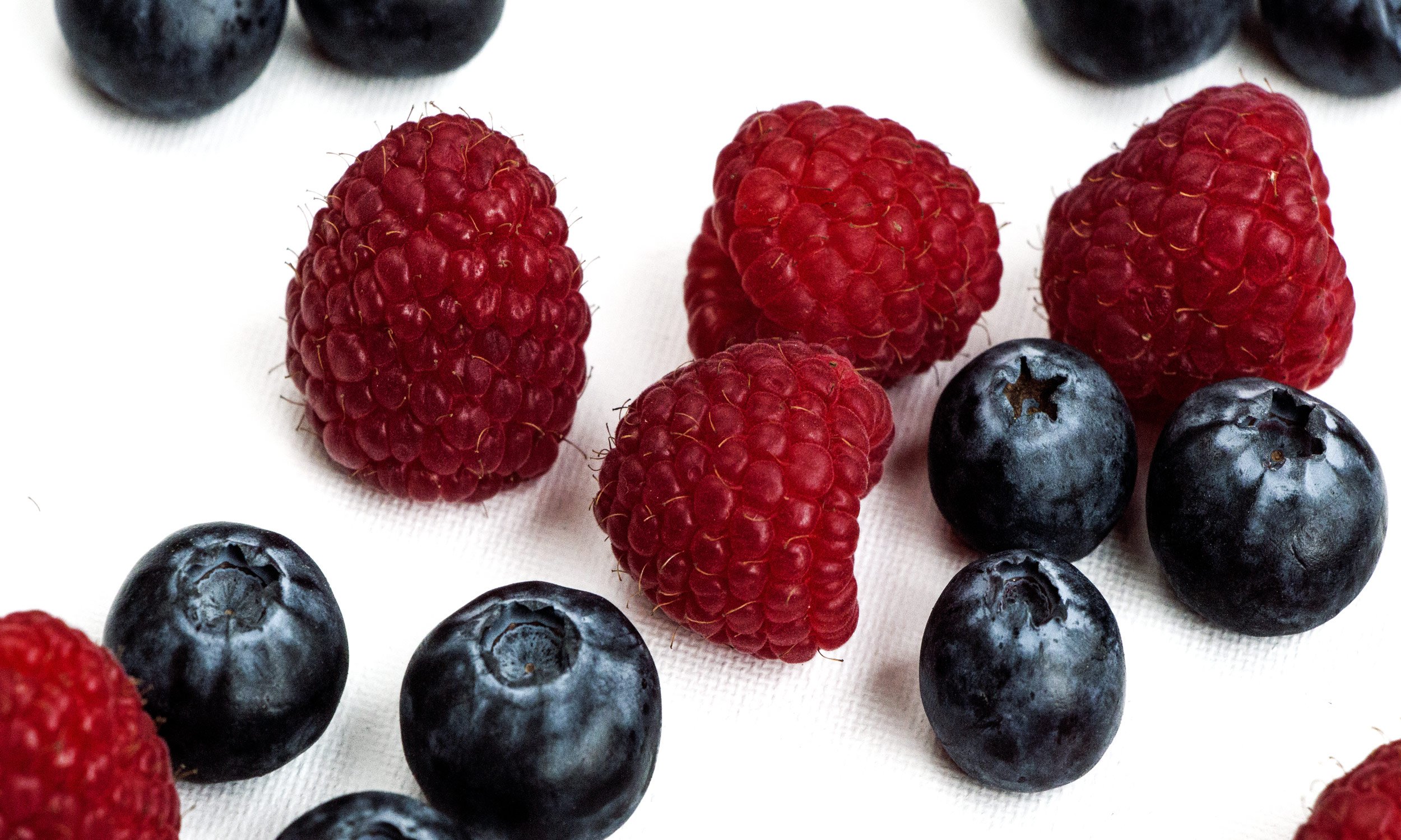
This was done to reflect the brand’s vision of mirroring the growing concern for the quality of food and fresh produce we intake, and that the same care should be taken for what we put on our bodies as well.
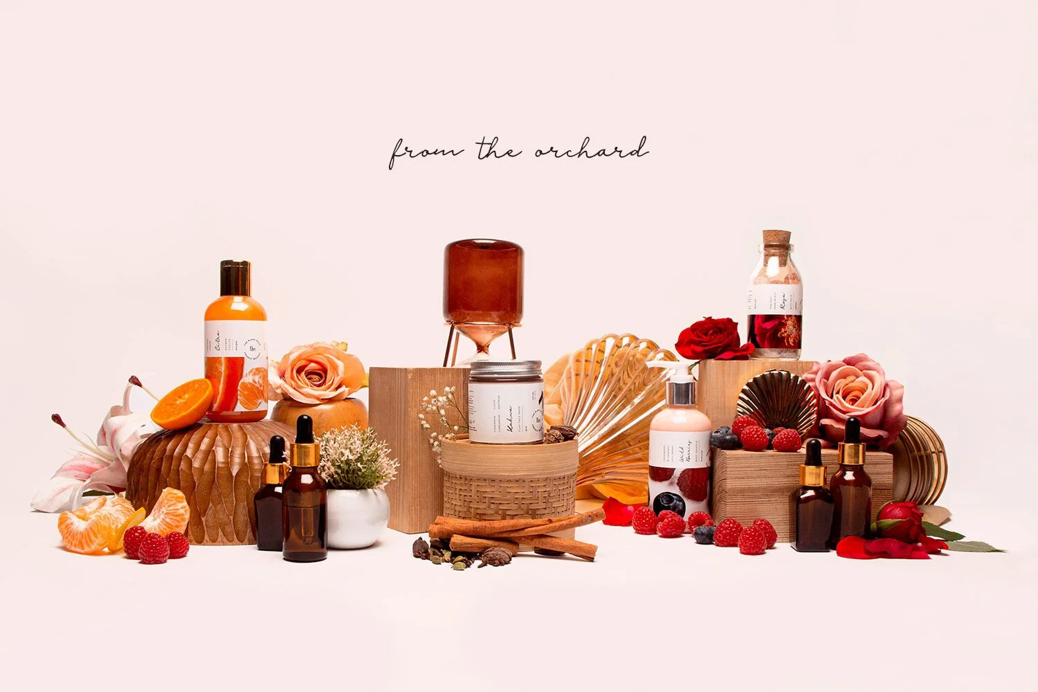

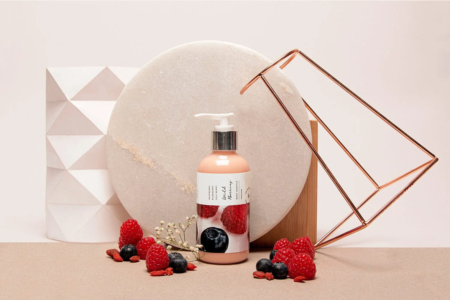
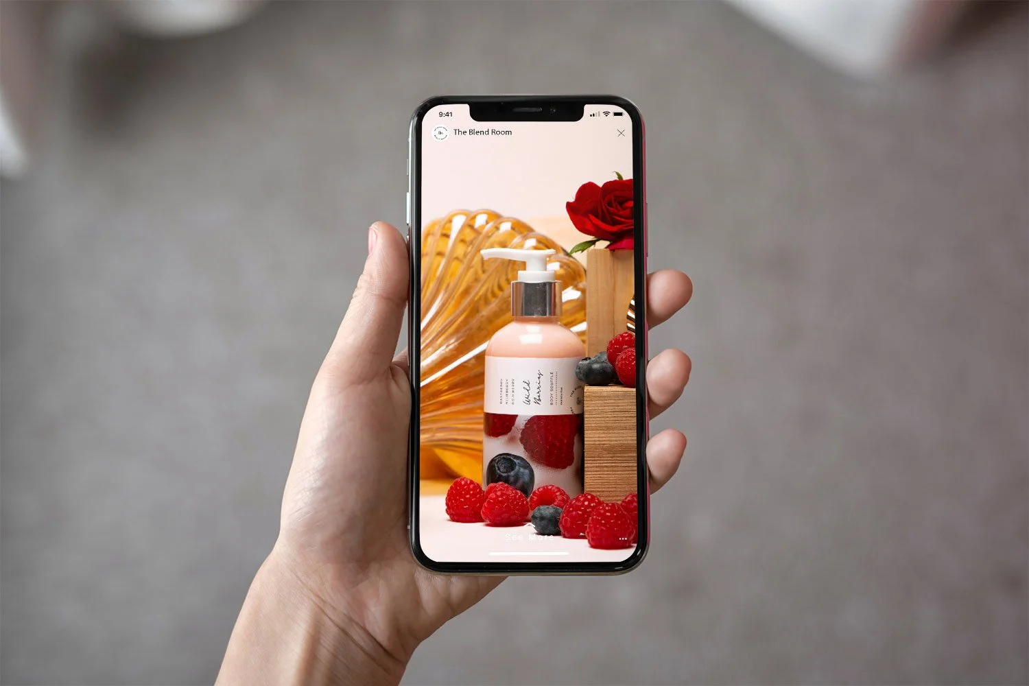

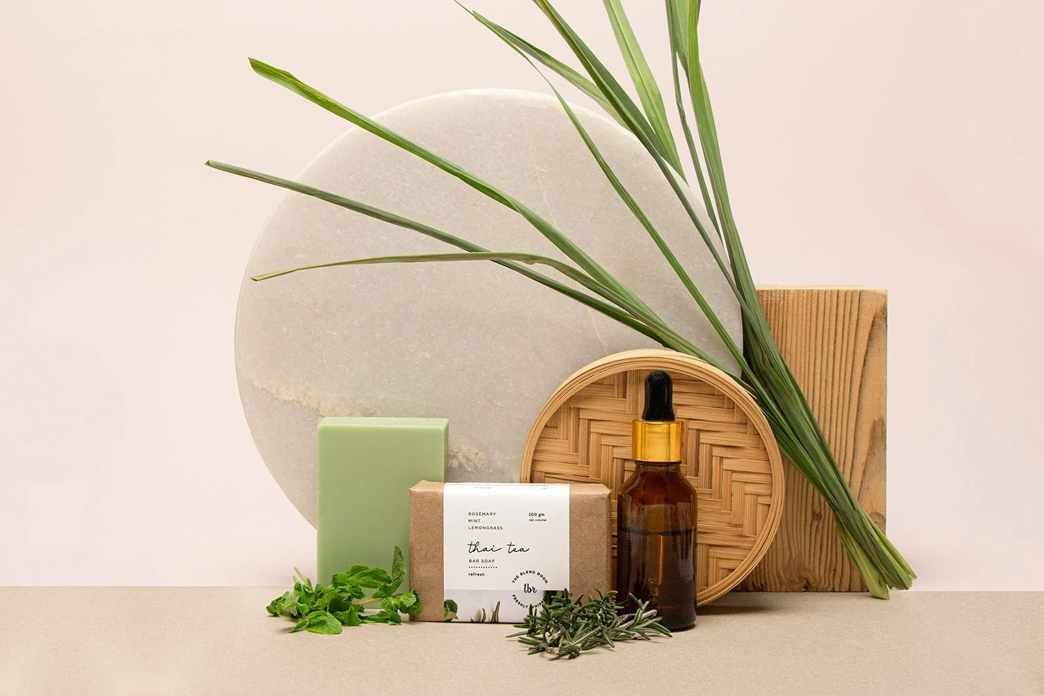
Re-imagining Beauty.
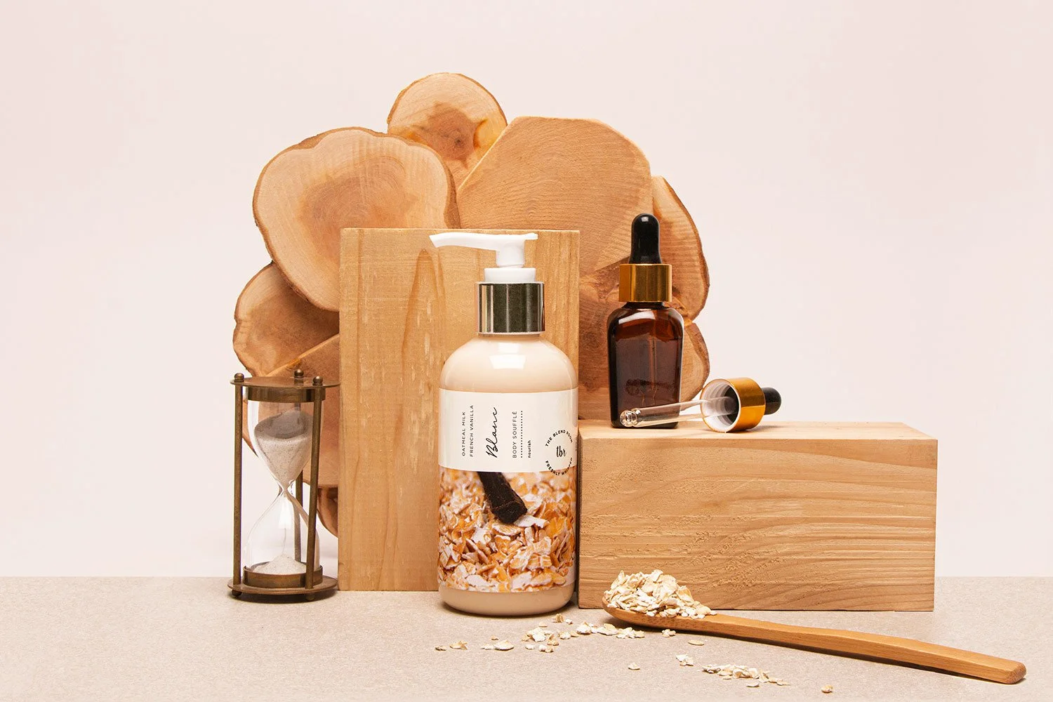
The aesthetic of the product line was meant to cue a minimal global look that is supported by vibrant imagery of the fresh ingredients used in the products. The typography and iconography are clean and have a breathable quality to them.